
Correlation is a widely used method that helps us explore how two variables change together, providing insight into whether a relationship exists between them. For example, imagine we want to understand if there is an association between time spent studying and exam scores. Or, maybe we think that people who eat more cookies are happier. Or, we want to see if people who live near a park hear more birds singing in the morning. Correlation is a valuable tool for understanding the extent to which variables are associated. It shows us whether two variables have a tendency to move together, and if they do, in which direction. If two variables are positively correlated, they move in the same direction, and an increase in one variable tends to lead to an increase in the other variable. Contrarily, when two variables are negatively correlated, they tend to move in opposite directions; as one increases, the other decreases.
It’s important to be aware that correlation does not mean the relationship is causal. Variables can be correlated without one necessarily causing change in the other, a concept called spurious correlation. A common example of this is finding that ice cream sales and drowning are positively correlated - as the sale of ice cream increases, the number of drownings also increases. However, this correlation is due to warmer weather which leads to people buying more ice cream and also swimming more.
In this article, we’ll explore bivariate correlation (i.e. correlation between two variables) using continuous variables, with a focus on Pearson and Spearman correlation. We will also calculate Kendall’s tau with ordinal data. The correlation coefficient values from Pearson, Spearman, and Kendall’s correlation provide a means to quantify the strength and direction of association between variables. The coefficients range from -1 to 1 where -1 is a perfect negative correlation, 0 indicates no correlation for the given measurement technique, and 1 is perfect positive correlation.
First, let’s load the packages we’ll use. If you do not have 1 or more of these packages installed, you can install them using install.packages().
library(ggplot2) # For plotting
library(dplyr)   # For data wrangling
library(tidyr)   # For data wrangling
Pearson correlation
The Pearson correlation coefficient, also called Pearson’s product-moment correlation and denoted as \(r\), is a measure of the strength and direction of a linear relationship between two variables. Remember, the coefficient values range from -1 to +1 with higher values indicating increasing similarity, 0 being no correlation, and lower, negative values having negative association.
Before calculating Pearson correlation, there are some important assumptions to consider:
- The variables are continuous
- The relationship between the variables is approximately linear
- There are no extreme outliers
Meeting these assumptions can help ensure valid results from the correlation analysis. For non-normal data, some researchers have found that transforming the data can reduce Type I and Type II error rates (Bishara & Hittner, 2012), while others argue that Pearson’s correlation is relatively robust to violations of normality (Havlicek & Peterson, 1976).
We will calculate Pearson’s correlation by generating data where each vector has 100 values. We’ll then use a scatter plot to visualize the data and check if the relationship between the variables appears approximately linear.
# For reproducibility
set.seed(97)
# Generate vectors p1 and p2
p1 <- rnorm(100, mean = 8, sd = 2)
p2 <- 0.5 * p1 + rnorm(100, sd = 1)
# Create a scatter plot
plot(p1, p2,
     main = "Scatterplot of p1 vs p2",
     xlab = "p1", ylab = "p2",
     pch = 19, col = "blue")
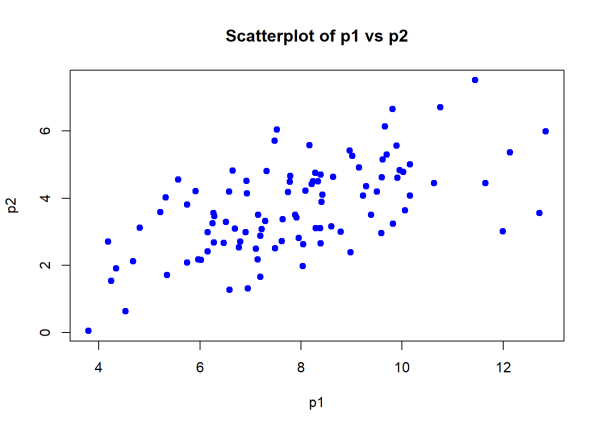
We will now move forward with calculating Pearson’s \(r\) to quantify the strength and direction of the linear relationship. The Pearson correlation coefficient is \[r = \frac{\sum (x_i - \bar{x})(y_i - \bar{y})}{\sqrt{\sum (x_i - \bar{x})^2 \sum (y_i - \bar{y})^2}}\]
We’ll calculate the mean of each of our variables, p1 and p1 using mean() to determine the average value.
# Calculate the mean of each variable
mean_p1 <- mean(p1)
mean_p2 <- mean(p2)
# Print the mean values
mean_p1
[1] 7.892793
mean_p2
[1] 3.704152
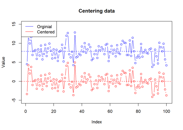
For each value in p1 and p2, we will subtract the respective mean value. By doing this, we are centering the data and seeing how much each value differs from the average value. In other words, we are calculating a value that tells us how far away a number is from its own mean. The mean of mean centered data will always be 0 (or very close) because the values have shifted so that the center value is 0.
We will mean center the data and then visualize the change using a plot of p1 and the centered, dev_p1.
# Center the data
dev_p1 <- p1 - mean_p1
dev_p2 <- p2 - mean_p2
# Plot original and centered data
plot(p1, type = "b", col = "blue", ylim = c(-5, 15),
     main = "Centering data",
     ylab = "Value", xlab = "Index")
# Add mean before centering
abline(h = mean(p1), col = "blue", lty = 2)
points(dev_p1, type = "b", col = "red")
# Add mean after centering
abline(h = mean(dev_p1), col = "red", lty = 2)
# Add legend
legend("topleft", legend = c("Orginial", "Centered"), col = c("blue", "red"),
       lty = 1)
Imagine that p1 is weight and p2 is height. dev_p1[1] tells us how far the first value is from the mean, and so on. When we multiply dev_1 and dev_2 together, element-wise, the product will be positive or negative. If the product is positive, both values are moving in the same direction (positive * positive = positive, negative * negative = positive value). If the product is negative, both values are moving in opposite directions. We create a plot to visualize how individual points contribute to determining the relationship between variables.
In the left plot, we’ll show p1 and p2 on the x and y axes, respectively, with a line for each of their mean values. In the right plot, we’ll visualize the deviations from each mean and color the points by the sign of their product.
It is customary to label quadrants on a plot starting in the top right quadrant and moving counter clockwise. Multiplying values within Quadrant I and Quadrant III result in positive values while multiplying values within Quadrant II and Quadrant IV result in negative values.
# ====== Plot original data with mean values ======
par(mfrow = c(1, 2))
plot(p1, p2, main = "Scatterplot of p1 and p2",
     xlab = "p1", ylab = "p2", pch = 19, col = "blue")
abline(h = mean_p2, col = "black", lty = 3, lwd = 2)
abline(v = mean_p1, col = "black", lty = 6, lwd = 2)
legend("topright", legend = c("Mean of p1", "Mean of p2"),
       col = c("black", "black"), lty = c(3, 6), bty = "n")
# ====== Plot centered data with mean of 0 ======
# Calculate product of deviations & set colors based on these values
prod_dev <- dev_p1 * dev_p2
colors <- ifelse(prod_dev > 0, "salmon", "cornflowerblue")
# Base plot
plot(dev_p1, dev_p2, main = "",
     xlab = "Deviations p1", ylab = "Deviations p2", pch = 19, col = colors)
# Add lines at mean values of 0
abline(h = 0, col = "black", lty = 3, lwd = 2)
abline(v = 0, col = "black", lty = 6, lwd = 2)
# Add vectors from origin
for (i in 1:length(dev_p1)) {
  lines(c(0, dev_p1[i]), c(0, dev_p2[i]), col = "gray", lty = 3)
}
# Add quadrant labels
x_offset <- max(abs(dev_p1)) * 0.65
y_offset <- max(abs(dev_p2)) * 0.65
text(x = x_offset,  y = y_offset,  labels = "Quadrant I (+,+)", cex = 0.9)
text(x = -x_offset, y = y_offset,  labels = "Quadrant II (-,+)", cex = 0.9)
text(x = -x_offset, y = -y_offset, labels = "Quadrant III (-,-)", cex = 0.9)
text(x = x_offset,  y = -y_offset, labels = "Quadrant IV (+,-)", cex = 0.9)
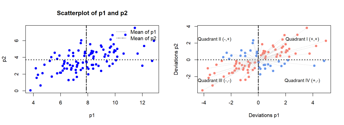
Each pair of values in the centered data (dev_p1 and dev_p2) are multiplied together and the the products of this calculation are summed. This step returns the sum of products of deviations which describes how variables change together.
Adding the products together produces a single value that will help determine the strength of the relationship. If the sum is large, both values tend to move together. If the value is small or close to 0, there isn’t a consistent pattern.
We then sum the squared deviations for each variable which tells us about the spread or variance around the mean.
# Calculate the sum of products of deviations
sum_product_dev <- sum(dev_p1 * dev_p2)
# Calculate the sum of squared deviations
sum_squared_dev_p1 <- sum(dev_p1^2)
sum_squared_dev_p2 <- sum(dev_p2^2)
The Pearson correlation coefficient is then calculated by dividing the summed product of deviations by the product of the sum of squared deviations.
# Calculate the Pearson correlation coefficient
pearson_correlation <- sum_product_dev / sqrt(sum_squared_dev_p1 * sum_squared_dev_p2)
# Print the result
print(pearson_correlation)
[1] 0.6006809
We can also use the cor() function in the stats package to calculate Pearson correlation. We will specify the method to be "pearson", although this is the default for the function. We get the same result of 0.60.
#Use  the `cor()` function to calculate Pearson correlation
cor(p1, p2, method = "pearson")
[1] 0.6006809
Spearman correlation
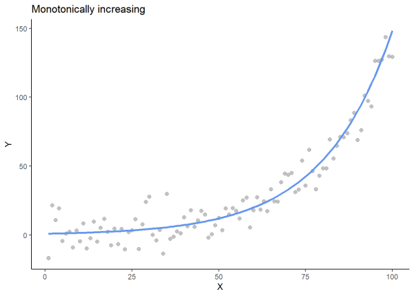
If there is a non-linear relationship between variables, Spearman correlation can be used to determine the strength and direction of monotonic relationships. Spearman correlation can be used with either continuous or ordinal data, and it is relatively robust to outliers.
You might also hear Spearman correlation referred to as Spearman rank correlation or Spearman’s rho (rs), denoted by \(\rho\). Spearman correlation measures the strength and direction of monotonic relationships, where both variables consistently move in the same direction. While the relationship beteen variables doesn’t need to be linear, it does need to remain consistent in one direction—either increasing or decreasing, but not both. When there is a change in direction, the relationship is no longer monotonic.
We will plot an increasing monotonic relationship, a decreasing monotonic relationship, and a relationship that is not monotonic to visualize these relationships.
# For reproducibility
set.seed(97)
# Generate x values
x <- seq(1, 100, by = 1)
# Create a monotonically increasing line
y_base <- exp(x / 20)
# Add noise
noise <- rnorm(100, mean = 0, sd = 10)
y <- y_base + noise
# Create a data frame
df1 <- data.frame(x = x, y = y)
# Plot
ggplot(df1, aes(x = x, y = y)) +
  geom_point(color = "gray60", alpha = 0.6, size = 2) +
  geom_line(aes(y = y_base), color = "cornflowerblue", size = 1.2) +
  labs(title = "Monotonically increasing", x = "X", y = "Y") +
  theme_classic()
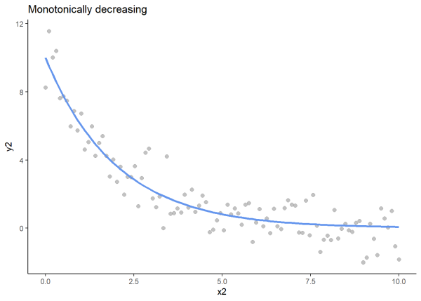
# For reproducibility
set.seed(97)
# Generate x, y values, and monotonically decreasing line
x2 <- seq(0, 10, length.out = 100)
y2_base <- 10 * exp(-0.5 * x2)
y2 <- y2_base + rnorm(100, sd = 1)
# Create data frame
df2 <- as.data.frame(x = x2, y2_base = y2_base, y2 = y2)
# Plot
ggplot(df2, aes(x = x2, y = y2)) +
  geom_point(color = "gray60", alpha = 0.6, size = 2) +
  geom_line(aes(y = y2_base), color = "cornflowerblue", size = 1.2) +
  labs(title = "Monotonically decreasing", x = "x2", y = "y2") +
  theme_classic()
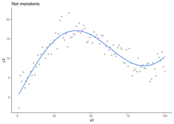
# For reproducibility
set.seed(97)
# Generate x values
x3 <- seq(1, 100, by = 1)
# Create a non-monotonic line (sine wave)
y3_base <- sin(x3 / 20) * 10 + x3 * 0.2
# Add random noise
noise3 <- rnorm(100, mean = 0, sd = 2)
y3 <- y3_base + noise3
# Create data frame
df3 <- data.frame(x = x3, y3_base = y3_base, y3 = y3)
# Plot
ggplot(df3, aes(x = x3)) +
  geom_point(aes(y = y3), color = "gray60", alpha = 0.6, size = 2) +
  geom_line(aes(y = y3_base), color = "cornflowerblue", size = 1.2) +
  labs(title = "Not monotonic", x = "x3", y = "y3") +
  theme_classic()
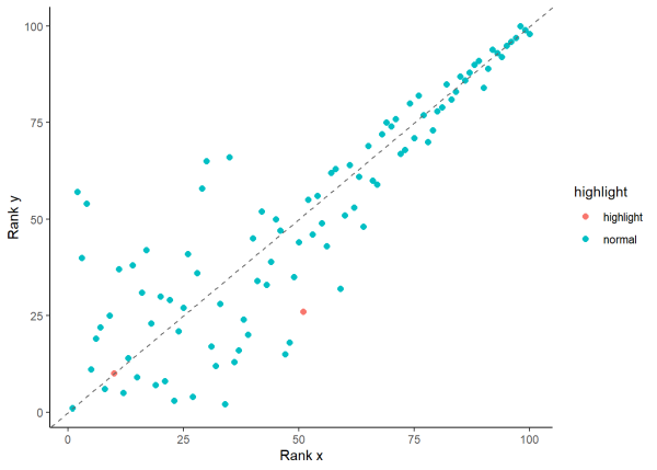
We will calculate Spearman correlation using the data frame df1 that we created above, which has an increasing monotonic relationship. First, we will rank our values by calling the rank() function on each of our variables. Recall that Spearman correlation is also known as Spearman rank correlation because it is based on ranked values of the data, not the raw data. Ranking data involves arranging values in order, such as from highest to lowest, and assigning a number to each value based on its new position. For example, if we have ice cream ratings of 3, 8, 5, 9, and 7, we can reorder the ratings as 3, 5, 7, 8, and 9. Then, we assign ranks based on their new positions: 1, 2, 3, 4, and 5. The data now has ranked values of 1, 4, 2, 5, and 3.
The rank() function makes quick work of this.
x <- c(3, 8, 5, 9, 7)
rank(x)
[1] 1 4 2 5 3
Let’s go ahead and rank our two variables.
# Rank the variables
df1$rank_x <- rank(df1$x)
df1$rank_y <- rank(df1$y)
We can visualize the ranks of our data by looking at a scatter plot of rank_x and rank_y. Points closer to the 1:1 line indicate stronger agreement while points farther away indicate greater deviations. For example, the corresponding ranked values in row 10 are (10, 10) and we can see they are plotted on the 1:1 line in pink. However, the ranked values in row 51 (51, 26) have a larger difference between them and are farther from the 1:1 line, colored pink.
# Highlight rows 10 and 51
df1$highlight <- ifelse(row.names(df1) %in% c(10, 51), "highlight", "normal")
# Plot
ggplot(df1, aes(x = rank_x, y = rank_y)) +
  geom_point(aes(color = highlight), size = 2) +
  geom_abline(slope = 1, intercept = 0, linetype = "dashed", color = "gray40") +
  labs(x = "Rank x", y = "Rank y") +
  theme(legend.position = "none") +
  theme_classic()
We then calculate the difference in ranks by subtracting rank_y from rank_x. By getting the difference between ranked pairs, this step measures how much the ranking deviates between 2 variables. A small difference indicates an observation has a similar ranking in both variables while a large difference shows greater disagreement in their rank positions.
We then square the differences to get positive values and highlight larger deviations. Larger numbers that get squared become much larger than smaller numbers.
# Calculate difference in ranks
df1$d <- df1$rank_x - df1$rank_y
# Square the differences
df1$d2 <- df1$d^2
We will substitute our values into the Spearman correlation formula:
\[ \rho_s = 1 - \frac{6 \sum d_i^2}{n(n^2 - 1)} \]
Where \(d^2_i\) is the squared difference in ranks (in our case, this is df1$d2) and \(n\) is the number of paired values. The number 6 in the numerator helps ensure that the correlation coefficient ranges from -1 to 1.
In the numerator, the squared difference in ranks (df1$d2) are summed to get a single number that gives the total deviation between the ranks of the 2 variables. This number is then multiplied by 6.
We find Spearman’s \(\rho\) to be 0.86.
# Assign n as the number of values
n <- nrow(df1)
# Spearman formula
spearman_rho <- 1 - (6 * sum(df1$d2)) / (n * (n^2 - 1))
# Print result
spearman_rho
[1] 0.8631263
We can also use the cor() function in the {stats} package to calculate Spearman’s \(\rho\) by including method = "spearman" as an argument.
cor(df1$x, df1$y, method = "spearman")
[1] 0.8631263
We see that both calculating by hand and using cor() give us a correlation coefficient of approximately 0.86. Considering that the correlation coefficient ranges from -1 to +1, a value of 0.86 indicates a relatively strong positive correlation. Notably, there has been much debate on interpreting correlation coefficients, so we direct the reader to additional resources, such as Akoglu (2018), for more information on interpreting correlation coefficient values.
Notably, Spearman correlation can still be calculated for non-monotonic relationships, although the results should be interpreted with caution. As a brief example, we generate data with a quadratic relationship and determine that \(\rho\) is -0.006. This correlation coefficient is practically 0, showing that while Spearman’s rank indicates almost no monotonic relationship, a clear quadratic relationship still exists between the variables.
# Simulate data with a quadratic relationship
set.seed(97)
df_quad <- data.frame(x_quad = seq(-3, 3, length.out = 100))
df_quad$y_quad <- df_quad$x_quad^2 + rnorm(100, 0, 1)
# Plot
ggplot(df_quad, aes(x_quad, y_quad)) +
  geom_point() +
  geom_smooth(method = "lm", formula = y ~ poly(x, 2),
              se = FALSE, color = "cornflowerblue") +
  labs(x = "x", y = "y") +
  theme_classic()
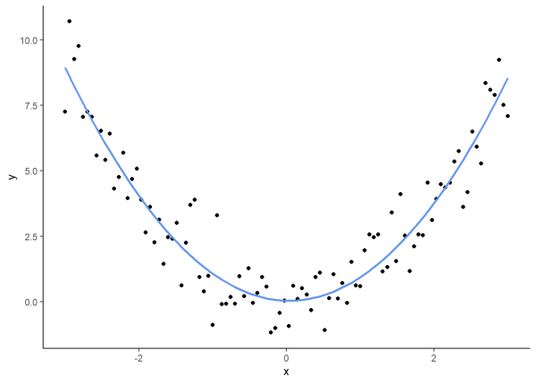
cor(df_quad$x_quad, df_quad$y_quad, method = "spearman")
[1] -0.006840684
Kendall’s tau
Kendall’s Tau, denoted as \(\tau\), is a non-parametric measure (i.e. makes no assumptions of the distribution of the data) and can be used to explore correlation between two ordinal variables. Ordinal variables include categorical data where the categories have a meaningful ranking, such as rating customer experience at the grocery store on a scale of 1 to 10.
To calculate Kendall’s \(\tau\), we first generate data and assign ranks to the values.
# For reproducibility
set.seed(97)
# Generate data
x <- sample(1:100, 10)
y <- sample(1:100, 10)
# Create a data frame
df <- data.frame(x, y)
# Rank `x` and `y`
df$rank_x <- rank(df$x)
df$rank_y <- rank(df$y)
# Print first 3 rows of `df`
head(df, n = 3)
    x  y rank_x rank_y
1   8 65      2      7
2  25 35      3      5
3 100 88     10      8
The formula for Kendall’s \(\tau\) is: \[\tau_a = \frac{C - D}{C + D}\] where \(C\) represents concordant pairs and \(D\) represents discordant pairs. Concordant and discordant pairs help explain the relationship between observations and are determined from ranked values, not the raw data.
To determine concordant and discordant pairs, we identify all unique pairs of our ranked values for each row of the data. For example, using the first 3 rows of df above, (2,7), (3,5), and (10,8) are ranked pairs of values and can be combined to form unique pairs of these ranked values:
- 1: (2,7) (3,5)
- 2: (2,7) (10,8)
- 3: (3,5) (10,8)
In pair 1, both ranks increase (an increase from 2 to 7 and an increase from 3 to 5) making it concordant while in pair 2, one rank increases (an increase from 2 to 7) and one decreases (a decrease from 10 to 8) making it discordant.
We will initialize counts for the concordant and discordant pairs, get the length of the data, and determine the number of concordant and discordant pairs.
# Initialize counts
C <- 0  # concordant
D <- 0  # discordant
# Get number of rows
n <- nrow(df)
# Loop over all unique pairs of rows
for (i in 1:(n - 1)) {
  for (j in (i + 1):n) {

    # Calculate differences in ranks
    dx <- df$rank_x[j] - df$rank_x[i]
    dy <- df$rank_y[j] - df$rank_y[i]

    # Check if pair is concordant or discordant
    if (dx * dy > 0) {
      C <- C + 1  # concordant
    } else if (dx * dy < 0) {
      D <- D + 1  # discordant
    }
  }
}
We have 21 concordant and 24 discordant pairs for a total of 45 pairs. This is because we have 10 ranks and each pair has 2 values, so the total number of unique pairs is 45, calculated by the combination formula:
\[ \binom{n}{2} = \frac{n(n - 1)}{2} \]
We then calculate Kendall’s \(\tau\) and find that the correlation coefficient is approximately -0.06.
# Calculate Kendall's Tau-a
(C - D) / (C + D)
[1] -0.06666667
We can also calculate Kendall’s Tau using cor() and specifying method = "kendall"
cor(x, y, method = "kendall")
[1] -0.06666667
There are different forms of Kendall’s Tau including \(\tau_a\), \(\tau_b\), and \(\tau_c\). \(\tau_b\) can account for tied ranks, where 2 or more observations have the same rank. Because tied values don’t have a clear increase or decrease, they can’t be easily counted as concordant or discordant. These ties are accounted for separately in the formula used for \(\tau_b\), which is the default when using cor(, method = "kendall") and there are ties. In this example, we calculated Kendall’s \(\tau_a\) using a simple data set with no ties for learning purposes.
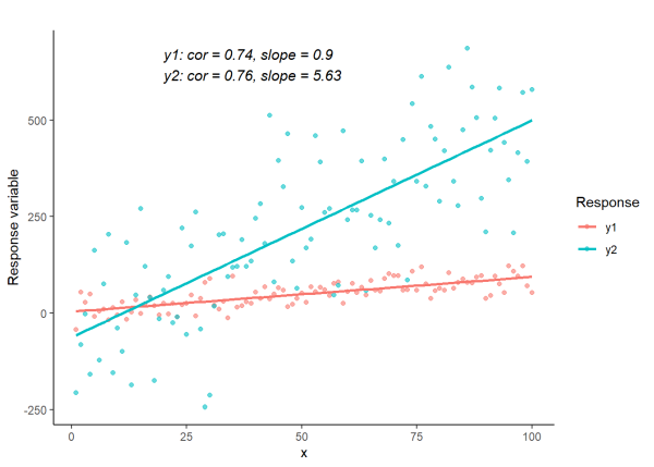
Correlation is not slope
It’s important to remember that correlation is not slope! Slope, denoted by m, tells us how steep a line is by measuring the rate of change between two variables. Slope tells us how much y increases or decreases for every one-unit increase in x and is defined by:
\[ m = \frac{(y2 - y1)}{(x2 - x1)} \]
Correlation tells us how much two variables move together, regardless of units or scale. Therefore, variables can have the same correlation coefficient and different slope values.
We will visualize this concept by plotting lines with a similar Pearson’s correlation coefficient and different slopes.
# For reproducibility
set.seed(97)
# Generate x
x <- 1:100
# Create a y1 with correlation ~0.7 with x1
y1 <- x + rnorm(100, mean = 0, sd = 25)
# Create y2 with approximately same correlation, but steeper slope
y2 <- 5 * x + rnorm(100, mean = 0, sd = 130)
# Create data frame
df4 <- data.frame(x = x, y1 = y1, y2 = y2)
# Get correlations
cor1 <- cor(df4$x, df4$y1, method = "pearson")
cor2 <- cor(df4$x, df4$y2, method = "pearson")
# Get slopes
slope1 <- coef(lm(y1 ~ x, data = df4))[2]
slope2 <- coef(lm(y2 ~ x, data = df4))[2]
# Labels for correlation and slope values
label <- paste0(
  "y1: cor = ", round(cor1, 2), ", slope = ", round(slope1, 2), "\n",
  "y2: cor = ", round(cor2, 2), ", slope = ", round(slope2, 2))
# Create plot
df4 %>%
  pivot_longer(cols = c(y1, y2), names_to = "Response", values_to = "y") %>%
ggplot(., aes(x = x, y = y, color = Response)) +
  geom_point(alpha = 0.6) +
  geom_smooth(method = "lm", se = FALSE) +
  annotate("text", x = 20, y = max(df4$y2), label = label,
           hjust = 0, vjust = 1, size = 4, color = "black",
           fontface = "italic", label.size = NA, fill = "white") +
  labs(title = "", x = "x", y = "Response variable") +
  theme_classic()
Additional information
Here, we reviewed Pearson, Spearman, and Kendall rank correlation, however there are additional correlation measures available that may be more suitable to other types of data or relationships. For example, Cramer’s V can be used for two categorical variables and polychoric correlation can be used for determining correlation between ordered categorical variables.
R session details
The analysis was done using the R Statistical language (v4.5.1; R Core Team, 2025) on Windows 11 x64, using the packages ggplot2 (v3.5.2), dplyr (v1.1.4) and tidyr (v1.3.1).
References
- Akoglu, H. (2018). User’s guide to correlation coefficients. Turk J Emerg Med., doi: 10.1016/j.tjem.2018.08.001.
- Bishara, A. & Hittner, J. (2012). Testing the significance of a correlation with nonnormal data: comparison of Pearson, Spearman, transformation, and resampling approaches. Psychological Methods, 17(3):399-417. doi: 10.1037/a0028087.
- El-Hashash, E. F. & Shiekh, R. H. A. (2022). Kendall Tau Correlation Coefficients Using Quantitative Variables. Asian Journal of Probability and Statistics, 36–48. https://doi.org/10.9734/ajpas/2022/v20i3425
- Havlicek, L., & Peterson, N. (1976). Robustness of the Pearson Correlation against Violations of Assumptions. Psychological Reports, 43(3), https://doi.org/10.2466/pms.1976.43.3f.1319
- Kuhn, M., Jackson, S., Cimentada, J. (2022). corrr: Correlations in R. R package version 0.4.4, https://CRAN.R-project.org/package=corrr.
- Makarovs, K. (2020). Correlation. (P. Atkinson, S. Delamont, A. Cernat, J. W. Sakshaug, & R. A. Williams, Ed.). Basics of Statistical Testing SAGE Publications Ltd. https://doi.org/10.4135/9781526421036905585
- Sapra, R.L., Saluja, S. (2021). Understanding statistical association and correlation. Current Medicine Research and Practice, DOI: 10.4103/cmrp.cmrp_62_20
- Wickham, H. (2016). ggplot2: Elegant Graphics for Data Analysis. Springer-Verlag, New York.
- Wickham, H., François, R., Henry, L., Müller, K., Vaughan D. (2023). dplyr: A Grammar of Data Manipulation. R package version 1.1.3, https://CRAN.R-project.org/package=dplyr.
- Wickham H, Vaughan D, Girlich M (2024). tidyr: Tidy Messy Data. R package version 1.3.1, https://CRAN.R-project.org/package=tidyr.
Lauren Brideau
StatLab Associate
University of Virginia Library
May 27, 2025
For questions or clarifications regarding this article, contact statlab@virginia.edu.
View the entire collection of UVA Library StatLab articles, or learn how to cite.