

Introduction
Virgo is the University of Virginia Library’s catalog, serving as the primary gateway to books, articles, and other library resources. Beyond search and discovery, Virgo supports a range of functions: users can place requests, find and create course reserves, organize and share bookmarks, set personal preferences, and access databases, subject guides, and journals.
Despite its central role in the library experience, Virgo hadn’t undergone a UX evaluation in four years. A fresh UX investigation was needed to understand how users engage with the site: what’s working, what isn’t, and where there’s room for improvement or new functionality. That investigation kicked off an iterative research and design process, one grounded in user data and evidence-based decision-making, aimed at reshaping Virgo’s interface to better meet the needs of its users.
Motivation
- To understand users’ diverse experiences with Virgo and its interface
- To map users’ navigation paths under different contexts of use
- To determine which elements and features required UX design attention
Methodology & Timeline
A 10-month, 5-phase mixed-methods study, June 2023 through April 2024, involving over 270 participants in total:
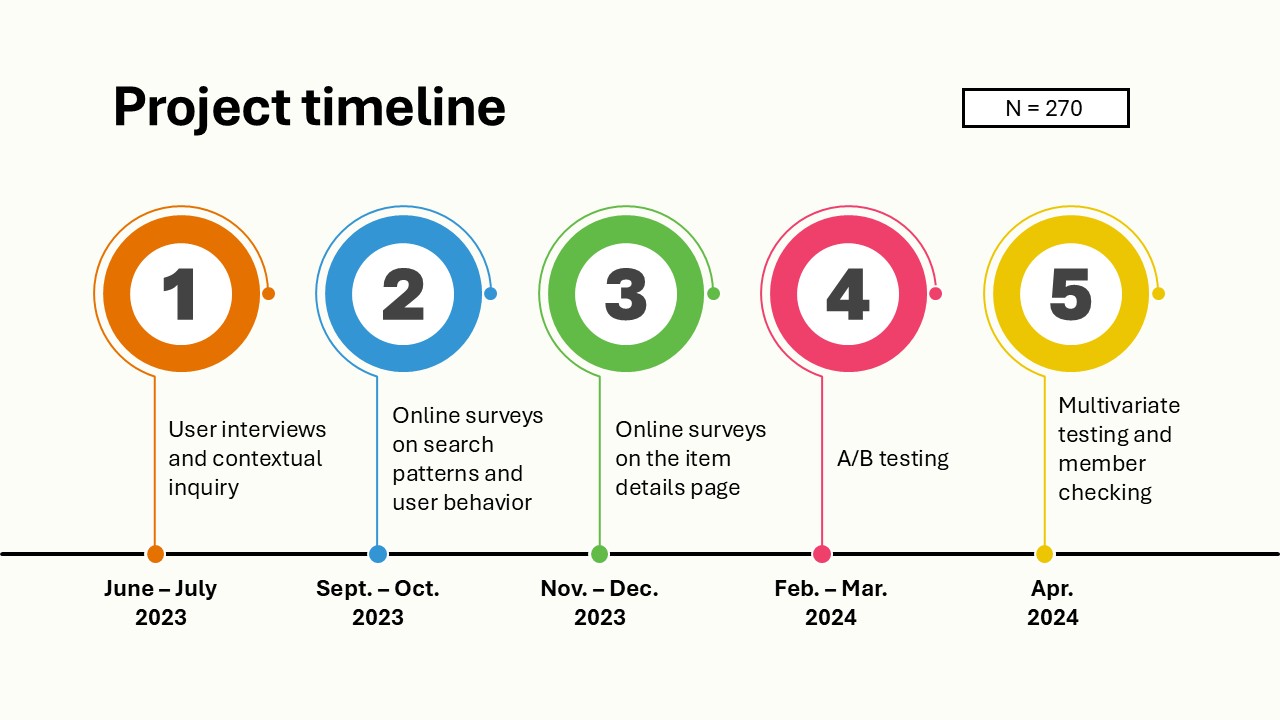
Phase 1: User Interviews and Contextual Inquiry — N=20
Methodology: Interviews covering demographics, frequency of use, motivations, and how users learned to use Virgo, paired with contextual inquiry: observing users think aloud as they (1) recreated a previous search, (2) searched for a topic, and (3) responded to a given prompt.
Findings — General Virgo usage:
- Filter options needed re-ordering.
“The ‘Date’ filter should be higher on the list.”
- Users liked the simplicity of the search results page and didn’t find it overcrowded.
- Users were satisfied with Advanced Search.
“I like it. It is straightforward and quite detailed. I use it when I know who the author is.”
Findings — Item Details page:
- Users wanted the Availability section and Request buttons higher on the page.
“Maybe there should be a separate section for availability, library, location and call number. And then Publisher and Publication Date can have another section.”
- Users wanted more visibility for the bookmark icon.
“It is far away from the information. I wouldn’t look all the way to the right. It is white and blends in with the background.”
- Information needed better categorization:
“Looks a bit basic. Like a list of information. The page feels overwhelming.”
User pain points identified:
- Information overflow on the Item Details page (especially for novice users)
- Lack of prioritization: Availability and Request actions were buried
- Lack of visibility on key actions (bookmark, share, etc.)
Design solution I: Chunking
Grounded in Miller’s cognitive load theory (short-term memory works best with roughly 5±2 meaningful “chunks” of information), we restructured the page by grouping related content into clearer, more meaningful sections with proper headings rather than one long list with nested functions.
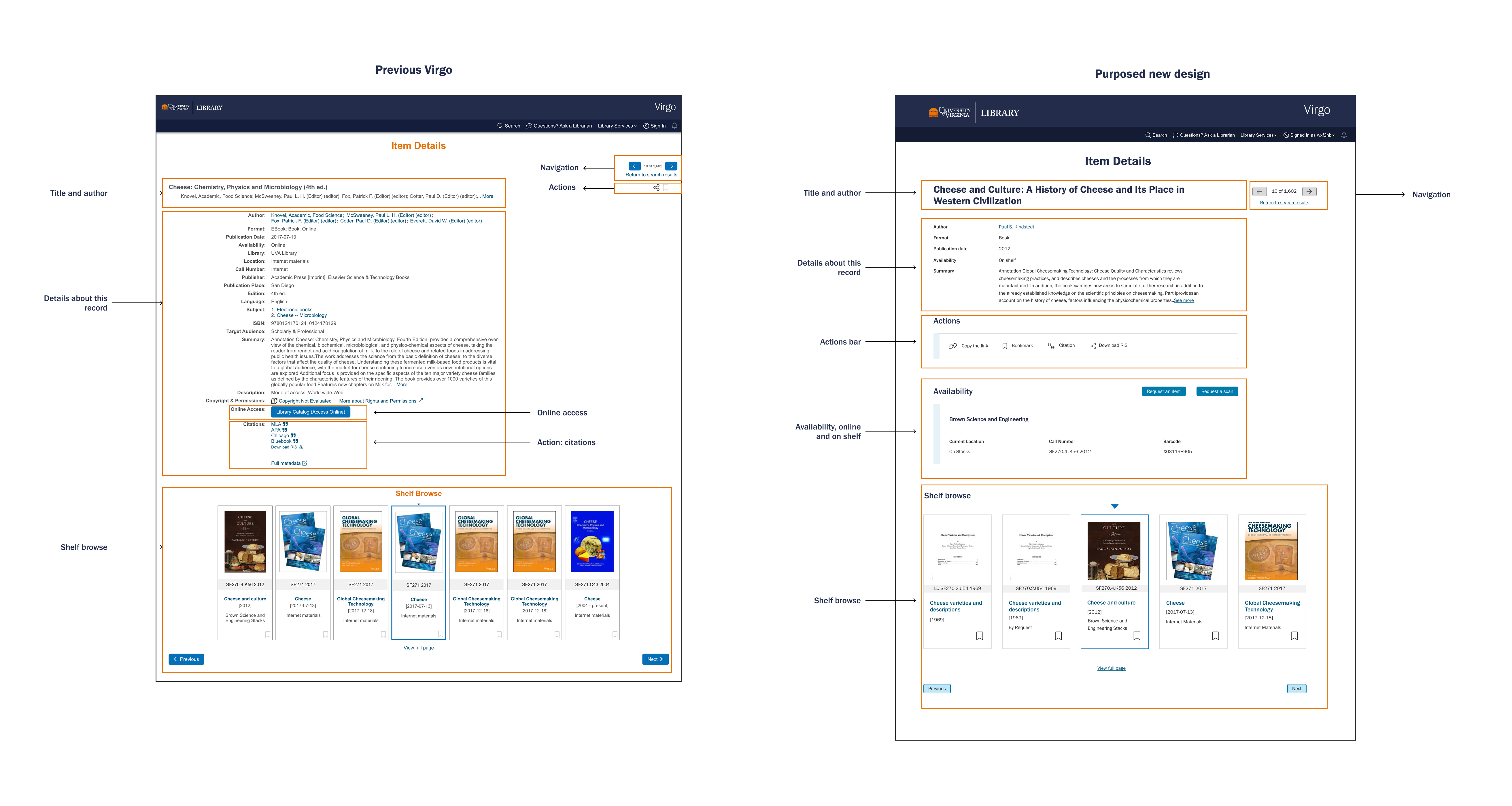
This meant:
- Splitting content into “Basic” (primary) information and “More details”, so novice users see 5-7 key pieces first.
- Consolidating all user actions (bookmark, citation, share, download) into a single Actions bar.
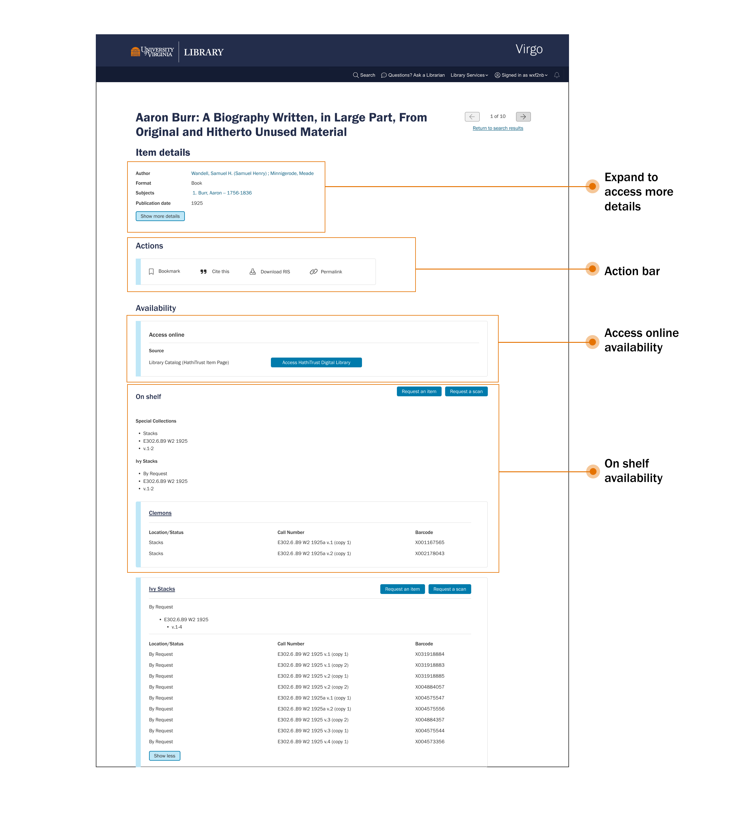
- Grouping Availability into its own section, split by online access vs. on-shelf access, with on-shelf copies grouped by physical location.
Design solution II: Visual hierarchy & reading patterns
The page’s button hierarchy was also redefined into three tiers:
- Primary (CTA): Request actions and their variants, the page’s core goal
- Secondary: Shelf browse navigation
- Tertiary: Item navigation arrows
English-language reading patterns were researched, and it was concluded that the page’s centered layout worked against natural left-to-right scanning. Headings and body text were shifted to left-aligned with more generous white space, producing a natural Z-pattern scan path rather than forcing the eye to relocate the start of each line.
Phase 2: Surveys on Search Patterns & Behavior — N = 91
Research questions: Are desired search results being shown? Do users want an “Ask a Librarian” popup? Do filter options need re-ordering?
While the prototype was in design, this phase ran in parallel, surveying broader search behavior to complement the interview findings at scale, informing the filter re-ordering and search pattern refinements carried into later phases.
Phase 3: Survey on the Item Details Page — N = 119
Methodology: A Likert-scale and open-ended survey comparing Version A (a cleaned-up version of the current Virgo) against Version B (the new prototype), with screenshots of each shown to respondents.
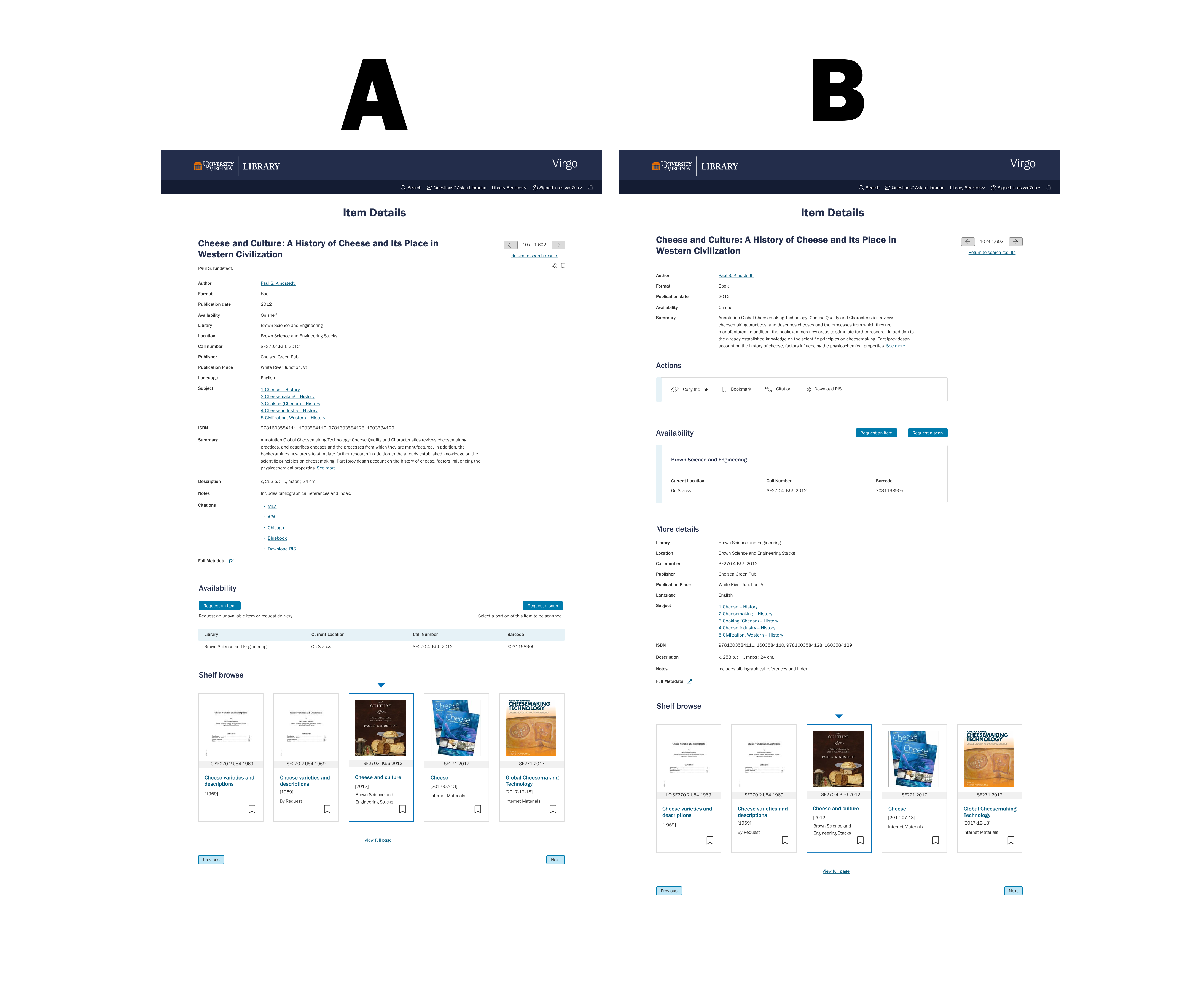
Findings — Preference:
- Version A: 42%
“More information at once makes it quicker.”
- Version B: 58%
“Skimming through this big block of information in Version A, even though it looks more concise, takes more time than scrolling down in Version B.”
Findings — Layout priority
| Section | Priority |
| Title & Author | 97% |
| Primary Information | 73% |
| Availability | 67% |
| Other Actions | 46% |
| Detailed Information | 44% |
| Shelf Browse | 24% |
This data directly raised the question carried into Phase 4: should Availability and the Actions bar be reordered relative to each other?
- Supporting usage data (Matomo, 2023)
Several existing features saw minimal real-world use — the “copy the link” button (0.35% of item details visits), Google Preview (0.75%), Download RIS (0.6%), and navigation buttons (4.0%). This data justified testing the removal or de-emphasis of these low-usage elements in the next round.
Design iterations from this phase:
- Removed navigation buttons and the “copy the link” function experimentally, to gauge user reaction.
- Repositioned “Access Online” to always appear first within Availability when available.
- Ordered physical library locations alphabetically.
- For multi-volume items, collapsed physical copies to show 5-7 by default with a “Show all” / “Show less” toggle.
- Finalized “Primary Information” content: Title, Author, Format, Publication Date, up to 5 Subjects, and a character-limited Summary.
Phase 4: A/B Testing — N = 17
Methodology: Demographic questions followed by think-aloud sessions comparing the current Virgo against the new prototype.
Findings: Most participants preferred Version B overall, primarily due to the Actions Bar, the Availability breakdown, and the primary/more-details separation. Novice and power users largely agreed on which content mattered most in “Primary Information” (Author, Format, and Publication Date ranked highest for both groups), though some participants misunderstood the new Availability section’s functionality, and a library liaison noted a preference for seeing more information on one screen.
Some tradeoffs and pain points surfaced. Power users found that splitting information into separate sections increased scrolling: “Information divided far apart makes their research harder.” Multiple “Request” CTA buttons created a confusing user flow.
Design iterations from this phase:
- Introduced two competing options to test next: a “Show more details” button vs. a “Brief record / Full record” toggle.
- Restructured Availability with a contextual “On shelf” divider, placing CTA buttons directly next to relevant sections; Special Collections retained its own distinct request button.
Phase 5: Multivariate Testing & Member Checking — N = 22
Methodology: Member checking via screenshots and emailed questions about the new “Show more details” button and toggle option, paired with multivariate testing comparing the two directly.
Findings — Member checking: All participants liked the “Show more details” button, citing consistency with peer platforms like WorldCat, its ability to serve multiple user types, and that it kept extra information optional rather than forced.
Findings — Multivariate testing: All participants preferred the button over the toggle:
“To me, having more options is always good. I don’t understand not wanting to scroll down or anything myself, it’s not a big deal to me. But it’s nice to see different options. I think this will make more users happy.”
Final UX team decisions
- Kept: Navigation buttons and the “copy the link” function, despite low Matomo usage — but renamed the latter to “Permalink” with a new icon and location, aligning with peer library terminology.
- Implemented: The “Show more details” button as the final approach, with primary information as the default view, removing the now-redundant separate “More details” section.

Final design
Below is a list of records with different types of availability, Bookplates funds, etc. — use these to explore how various record types fit within the new item detail page design:
- A record with online availability: Cheese: Chemistry, Physics and Microbiology (4th ed.)
- A record with multiple copies and special instructions: Annual Report of the American Bible Society
- A record with multiple availabilities: Aaron Burr: A Biography Written, in Large Part, From Original and Hitherto Unused Material
- A record with Bookplates Fund: Educated: A Memoir (First edition.)
- A record with multiple online access options: Physicochemical and textural characteristics and volatile compounds of semihard goat cheese as affected by starter cultures
Conclusion and Outcome
The redesigned Item Details page launched the following semester, implemented by the development team based on the final validated prototype. Validation across user segments showed real, if varied, impact: students reported the new prototype as a significant improvement, particularly valuing the Actions Bar, categorized Availability, and the Primary/More Details split; faculty appreciated the efficiency gains, especially for complex records like periodicals and multi-volume works; and staff members, while more neutral on the Actions Bar specifically, valued the overall efficiency and the “Show More Details” button. The result was a catalog page that surfaced what users needed first, without sacrificing the depth power users relied on, validated by user data at every major decision point.